Same Spreadsheet, 3 ChatGPT Analysis Workflows: Summary vs Diagnostic vs Decision Support
Uploading a spreadsheet to ChatGPT is easy. Asking the right question is harder. The same workbook can produce a shallow summary, a useful diagnosis, or a decision-ready analysis depending on what you ask the model to do.
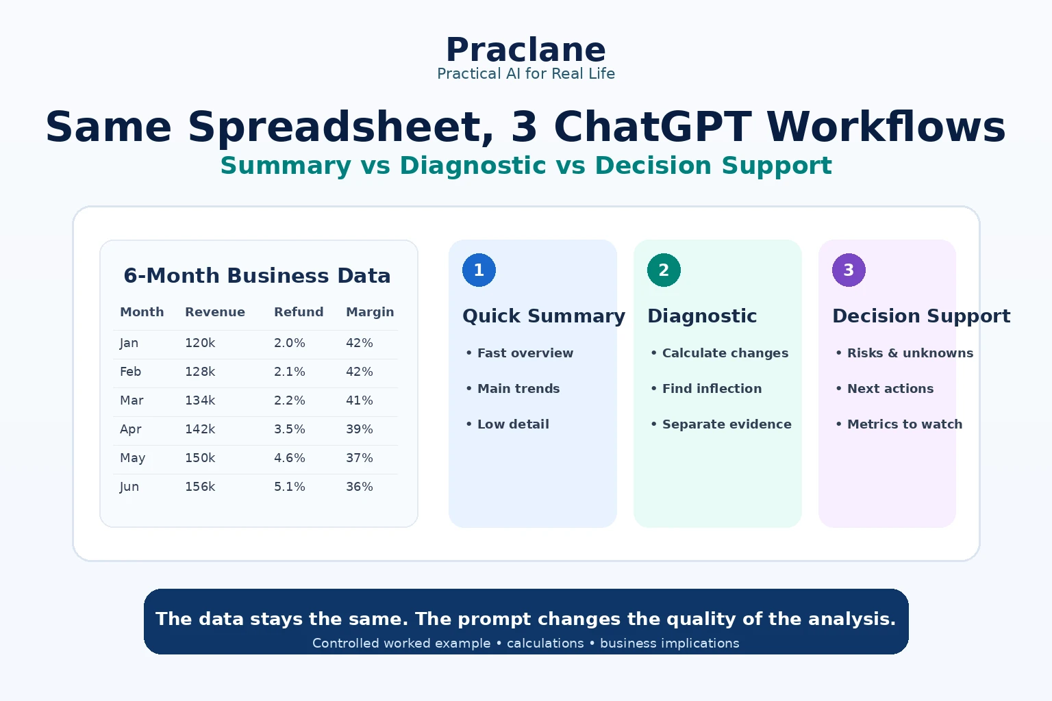
This article uses one small fictional business dataset and runs it through three different ChatGPT analysis workflows: quick summary, diagnostic analysis, and decision support. The point is not to benchmark ChatGPT scientifically. It is to show how prompt structure changes the level of business insight you ask for.
The Test Dataset
Imagine a six-month ecommerce report with these fields:
| Month | Revenue ($k) | Orders | Refund Rate | Ad Spend ($k) | Support Tickets | Gross Margin |
|---|---|---|---|---|---|---|
| Jan | 120 | 1,000 | 2.0% | 20 | 85 | 42% |
| Feb | 128 | 1,060 | 2.1% | 21 | 90 | 42% |
| Mar | 134 | 1,110 | 2.2% | 22 | 92 | 41% |
| Apr | 142 | 1,180 | 3.5% | 28 | 130 | 39% |
| May | 150 | 1,240 | 4.6% | 34 | 170 | 37% |
| Jun | 156 | 1,290 | 5.1% | 37 | 188 | 36% |
The headline numbers look positive: revenue rose from $120k to $156k and orders rose from 1,000 to 1,290. But the quality of that growth is deteriorating. Refund rate increased from 2.0% to 5.1%, support tickets more than doubled, ad spend rose sharply, and gross margin fell six percentage points.
Workflow 1: Quick Summary
Summarize the main trends in this spreadsheet. Keep the answer concise and highlight the most important changes.
What This Prompt Encourages
- Identify obvious upward and downward trends
- Reduce the workbook to a few headline observations
- Avoid deep causal analysis
- Optimize for speed and readability
Likely Useful Output
A good quick summary should notice that revenue and orders are growing while margin, refund rate, and support burden are worsening. It may also mention higher advertising spend.
This is useful when you need orientation. It is weak when the real question is why the business is changing or what you should do next.
Workflow 2: Diagnostic Analysis
Analyze this spreadsheet for changes in business quality, not just growth. Calculate the percentage change from January to June for revenue, orders, ad spend, refund rate, and support tickets. Calculate the gross-margin change in percentage points. Then identify inflection points and relationships that deserve investigation. Separate observations from possible explanations.
What This Prompt Adds
- Explicit calculations
- A defined comparison period
- Attention to unit differences
- Inflection-point detection
- Separation of evidence from hypothesis
What the Numbers Show
| Metric | Jan → Jun Change | Interpretation |
|---|---|---|
| Revenue | +30.0% | Strong top-line growth |
| Orders | +29.0% | Growth broadly matches revenue |
| Ad Spend | +85.0% | Acquisition cost pressure may be rising |
| Refund Rate | +155.0% | Major deterioration in post-purchase quality |
| Support Tickets | +121.2% | Customer friction is rising much faster than orders |
| Gross Margin | -6 percentage points | Growth is becoming less profitable |
The key inflection starts around April. That is when refund rate jumps from 2.2% to 3.5%, support tickets rise from 92 to 130, ad spend increases materially, and margin falls below 40%.
A diagnostic prompt does not prove that marketing caused refunds or that support problems caused margin decline. It tells you where the pattern changes and which relationships deserve investigation.
Workflow 3: Decision-Support Analysis
You are preparing a weekly management review. Use this spreadsheet to answer: Is the current growth pattern healthy enough to keep scaling? Give a decision brief with 1) evidence, 2) risks, 3) unknowns, 4) three actions for the next 30 days, and 5) metrics to monitor. Do not invent causes that the data cannot prove.
What Changes Here
The analysis now has a decision. Instead of describing the spreadsheet, ChatGPT has to organize evidence around whether scaling should continue unchanged.
A Strong Decision Brief Would Say
- Evidence: revenue and orders are growing, but ad spend, refunds, and support demand are increasing much faster.
- Risk: scaling acquisition before fixing post-purchase friction could amplify unprofitable growth.
- Unknown: the spreadsheet does not identify whether refunds come from product quality, fulfillment, customer mix, promotion strategy, or another factor.
- Action 1: segment refunds and support tickets by product, channel, and cohort.
- Action 2: compare acquisition efficiency before and after the April inflection.
- Action 3: set a temporary guardrail for scaling until refund rate and margin stabilize.
- Monitor: refund rate, gross margin, support tickets per 100 orders, revenue per order, and ad spend per order.
The Comparison
| Workflow | Best For | Main Strength | Main Weakness |
|---|---|---|---|
| Quick Summary | Orientation | Fast and readable | Can stay superficial |
| Diagnostic | Understanding what changed | Calculation and pattern detection | Does not automatically create a decision framework |
| Decision Support | Management action | Connects evidence to next steps | Quality depends heavily on the decision question |
Why the Third Prompt Is Usually More Useful at Work
Most workplace spreadsheet questions are not really “What does this file say?” They are “What should I pay attention to, what is risky, and what do I do next?”
That does not mean every prompt should ask for recommendations. When you are still exploring unfamiliar data, diagnosis should come before action. The useful sequence is often:
- Understand the structure.
- Verify important calculations.
- Find anomalies and inflection points.
- Ask what the data can and cannot establish.
- Only then request decision support.
A Reusable Spreadsheet Prompt Template
Analyze this spreadsheet for [decision or business question]. First inspect the structure and identify any data-quality problems. Then calculate [specific metrics] for [time period or groups]. Separate direct observations from possible explanations. Flag anomalies and conflicting values. Finish with the implications for [audience/decision], the main unknowns, and the next analyses you would run before acting.
Important Limitations
- Correlation is not causation. A spreadsheet may show variables moving together without proving why.
- Poor column names and mixed tables can reduce analysis quality.
- Exact numbers should come from structured cells, not screenshots of tables.
- Review generated calculations and code before using them for important decisions.
- Ask ChatGPT to state assumptions instead of silently filling missing information.
OpenAI recommends clear column headers, one record per row, and avoiding empty rows or columns that split a dataset. ChatGPT can create tables and charts and may use Python for calculations and transformations.
For broader spreadsheet workflows, see our ChatGPT for Excel guide. For another controlled prompt experiment, compare our same-PDF workflow test.
Official Sources
Final Thoughts
The spreadsheet did not change. The question did. A summary prompt helped us see the file, a diagnostic prompt helped us understand the pattern, and a decision-support prompt turned the same evidence into a management discussion.